Here're a couple of pictures of the kitchen and dining corner of the home which I have introduced earlier here, here and here. The kitchen was decided to leave the way it was, and then later when they've been living there for some time to reconsider if a reno should be done. In this home only the walls were repainted.
As there was a small nook for a dining area, decided to use it as it was meant to. The kitchen cabinets have a dark-ish mud colour, so it was quite clear to use all-white there, meaning that the dining table and chairs are white as well as a storage unit and a pendant lamp above the table.
Colourful drawings and paintings as well as tableware make the corner cosy and playful.
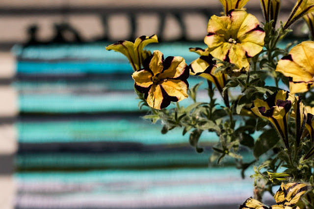
There're two balconies - one facing the river and the other one facing the garden between houses. Outdoors the colour palette is almost the same as inside - shades of blue and a hint of yellow.
PS. the round table is from Ikea and the chairs from Vakum Design.


Your home is lovely!!! I love everything so bright and clean.
ReplyDeletehttp://xoxobella.com
Thanks, Bella. But it's not my home;)
DeleteWhat a lovely corner you've got there. I love bright furniture and painting - it brings so much life!!
ReplyDeleteThank you! I like to play with colours.
DeleteAmazing pictures of the kitchen and dining corner! I love colorful paintings and vivid colors! Very creative!
ReplyDeleteThank you, Eugenia!
DeleteHow wonderful these colors really are? Great choices and captures! Yes - everything is so bright! love it!
ReplyDeleteGreat! Thank you so much!
DeleteOh gosh! Simply adorable and well-thought corner. Love the details on the sides.
ReplyDeleteThank you, Jessica!
DeleteWhat a pretty dining corner of this room. I love your use of a white palette and then clever use of colour as proved by artwork and colourful cotton rag rugs on the floor.
ReplyDeleteThank you! White is such an easy colour and you can always add any colours with it.
DeleteI love the combination of colours it looks creative yet minimalistic. It looks bright and fresh. x
ReplyDeleteI like the idea about the colorful pictures in the corner!
ReplyDeleteLove,
Ivelisse | CarnationDreams.com
Thanks! They give nice feeling to the otherwise white corner.
DeleteIt looks so elegant but i have a little bit worry about the white color, cause in my opinion it will be pitied if the white color is dirty
ReplyDeleteI understand your concern but white is not that delicate. It's pretty easy to keep it clean and as you se the dirt there immeditealy you will also clean it straight away so no stains left.
Delete